
The first things you notice about Theodore Berglund are his hands. They’re large and flat like paddles. He could, given the right boat, paddle you to shore pretty easily. His art reflects the same versatility. It can cut into a placid lake like a razor, or come close to cracking your skull when you least expect it.
Berglund himself could scare you; he’s a tall large man with a beard that features two white streaks. They look almost as if he’d painted them on himself. When we met in Princeton, he was limping from a problem that developed in his knee after a surgery. He doesn’t smile much; that is, if you aren’t paying attention. When he laughs his whole body shakes but his mouth opens only barely.
Still, he’s excellent at controlling the tone of his voice in a conversation, and his features are persuasive. As serious as Berglund can look, he is a jocular guy, who prefers a wise crack to angry retort as a means of getting his point across.
While almost all of Berglund’s painting is abstract, it ranges dramatically in form, content, and medium. The one thing that stays constant is his powerful sense of color.
The painting above, commissioned for the North End Bistro in Princeton, is a striking example. Notice how clear are the strokes, how easily the colors blend into and complement each other sometimes unexpectedly. The texture in Berglund’s paintings is used to simple but invigorating effect. He seems to understand the spaces where his paintings hang. That might explain why he’s done so well recently; hanging shows and earning commissions from local designers.
In the past six months Berglund has hung more than six shows throughout central New Jersey. Most recently he hung 59 paintings at Triumph Brewery, a mainstay of Nassau Street. The paintings there are almost all examples of his newest exploration in cutting.

In these paintings the movement isn’t limited to cuts, although they do serve to “fascinate” the audience as Berglund says. Under the right lighting the brush strokes once again demand attention and deliver texture. The cut paintings seem to focus on texture. The cuts are violent, animal, and in contrast to the playful color he generally uses for this series. He explains:
It’s also very visceral which I think is something people appreciate. Lots of times I keep it light with the cuts, like I’ll put a pretty color on ‘em, because it gives it a lightness to go with the violence. I think that with the cut paintings as an example, when [the viewer] observes a painting [the viewer is] looking at the result of somebody’s actions. [They] are constantly thinking about the creative process, and those actions—and this is really important for me—are cut in a specific point of time… It’s deliberate and final.
I like the painting because the cuts reveal the color of the wall behind the painting, and the colors work well together. That was the result of an apparently meticulous design process. The colors fit so well that I get a really strong urge to eat this painting, because it might taste of watermelon. It serves its purpose at the restaurant. Berglund also acknowledges this,
There are three things, the color, the cuts, and the surface of the paint. That’s what I really like, they become objects and they are more “designy” than other paintings. You can put them into groups; they work well in modern spaces.

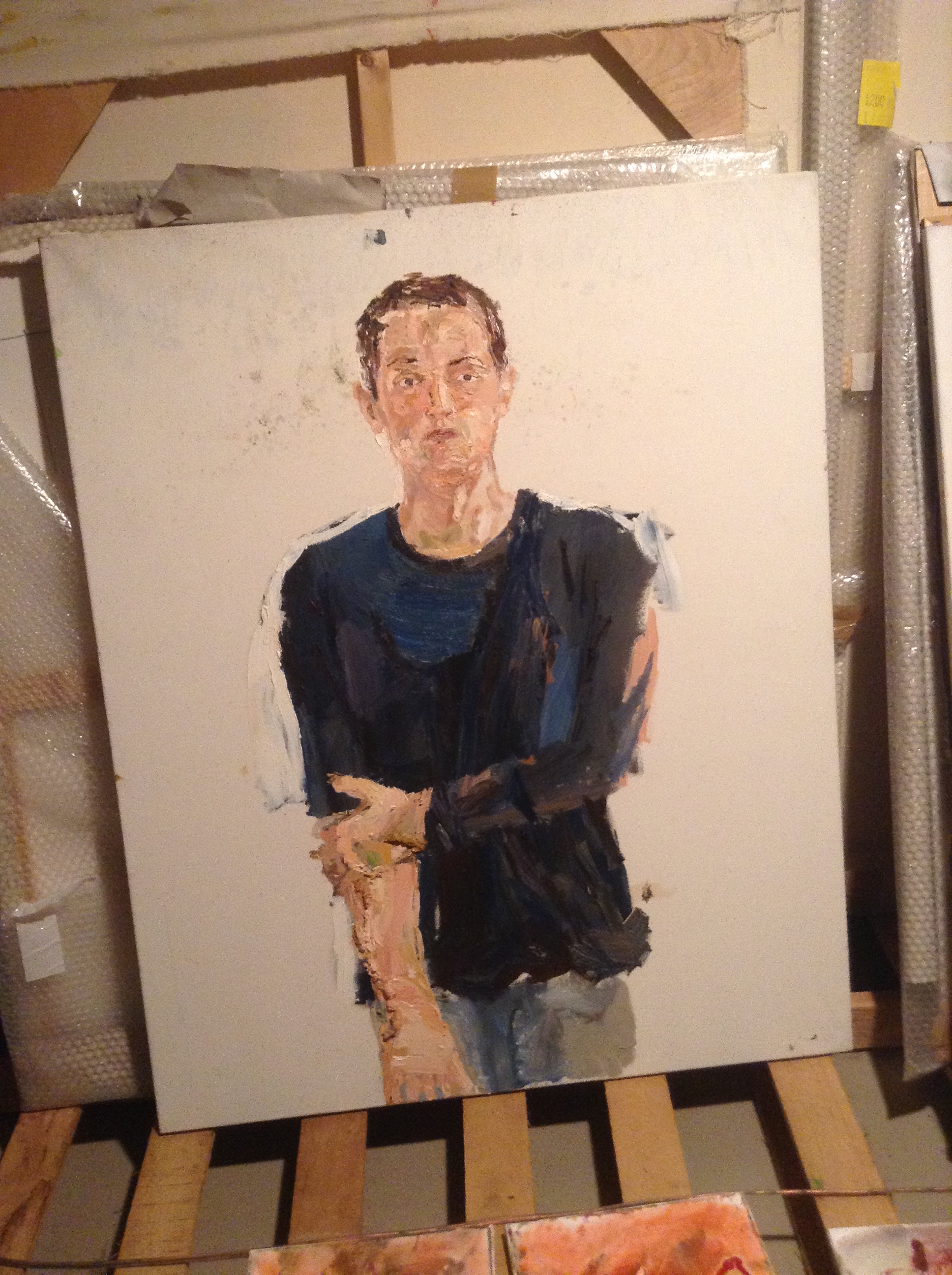
I’ve seen many of Berglund’s paintings, both throughout Princeton, where they aren’t hard to find, and at his house in Pennington. His living room and basement are stacked with canvases. The basement floor is covered in paint, the ceiling protected with cloth. There are empty paint tubes thrown everywhere and an old radio where something like The New World Order or Depeche Mode probably plays as he works. His most personal pieces can be found here.These paintings are thrilling, sometimes nonsensical, sometimes bordering on tortured.
This one hangs over Berglund’s couch. It reminds me of a beach seen from at the edge of a jungle. It’s an older painting, one of the first he did with this sort of abstract layering.

The painting below is one of his latest, and you can see the progression of layering here. Berglund notes:
There is a lot of layer, a lot of texture on that. Some of the paint is about an inch tall. Basically I had these colors and I took this big squeegee and went over it. I spun the squeegee around and I realized I could make a heart. It all happened quick. I always wanted to paint a heart. There’s this painter Jim Dine and he painted a lot of hearts. I’ve always really liked them. It’s upside down that comes from my teacher he did everything upside down.

Berglund’s teacher was Georg Baselitz of Germany, where Berglund lived for some seven years. His two sons also live in Germany. Even though it was a long time ago it’s easy to tell that the experience defined him in many ways as a person and as a painter.
Now that I think of it, he could very well be the lead engineer at BMW or some German business person; he has that sort of exacting vibe about him. Yet, his paintings say everything otherwise. They hint at the chaos inside of an organized mind where, even in the setting of overwhelming emotions, sharp distinguishing lines emerge as deliberate, final, and violent. And still playful.
Ted Berglund is selling pieces and posters at Triumph and North End Bistro in Princeton between today and Christmas, 2013.
